 I've been hating my iPhone lately and I've got a love-hate relationship with my Lumia 920 so my buddy at AT&T loaned me a Blackberry Z10 for a month to try out. This is the same buddy who loaned me an AT&T Unite Hotspot in May. These are loans, I don't keep them.
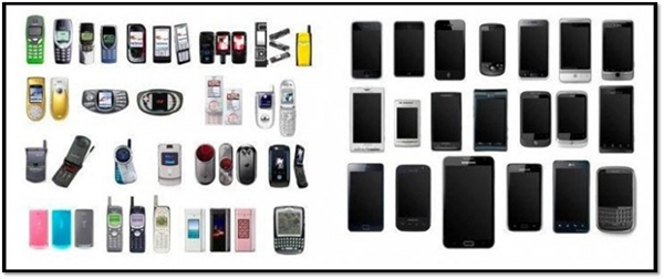
Imagine a world where there is no iPhone and there is no Android and there is no Windows Phone. In this world, the Blackberry rocks. Not just rocks, present-tense, but rocked, past tense.
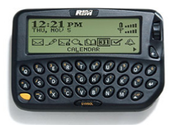
I mean, seriously, the RIM 950 had an Intel 386 and 4MB of RAM. That thing ran for a week on a AA battery and changed my life. Blackberry connected me. That was truly innovative. Research in Mobile changed mobile forever.
The Blackberry Z10 changes nothing. It pains to me to say this, truly it does. I'm sure that in some parallel universe Blackberry is on top and Mr. Spock has a beard. But on this planet, Mr. Spock has an iPhone (or probably a rooted iPad Mini that runs LCARS).
But, still, I ran with a Blackberry Z10 for a month and I tried, I really did. It's a lovely device, the Blackberry Z10, make no mistake. But, it's a Blackberry-iPhone. It's evil Spock, not Spock - a mirror if you will.
Don't we all appreciate the innovation in phone design that's happened since the introduction of the iPhone?
But is it a Blackberry? Kind of. It has BBM (BlackBerry Messenger) but that's where it ends. It actually feels more like the lovely HP TouchPad's webOS than like anything I've seen in the Blackberry universe. It's certainly more visually polished and consistent than any Android I've used, has more clarity and depth than a Windows Phone and is some how as fluid as an iPhone.
Moving Around
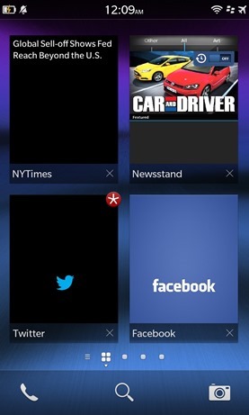
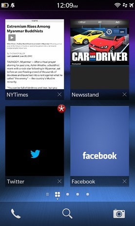
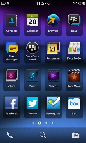
You can move in and out of apps within a grid of four running apps. It's similar to the row of thumbnails you see on iPhone iOS7 or Windows Phone, except in a grid. One nice touch is that some apps, like the NYTimes for example, can opt-in and draw a custom tiny thumbnail of their own. Apps that choose not to just show a standard thumbnail. This is a small but under-utilized touch that has potential if it takes off with developers.
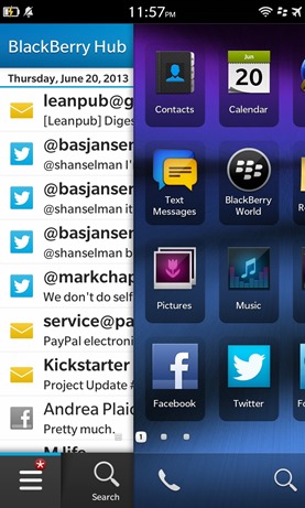
You swipe left and right between the Blackberry Hub on the far left, the running task list, and the actual app launch takes up the remaining screens.
Browsing
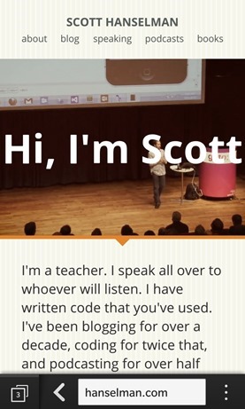
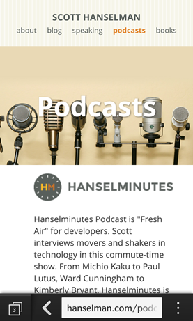
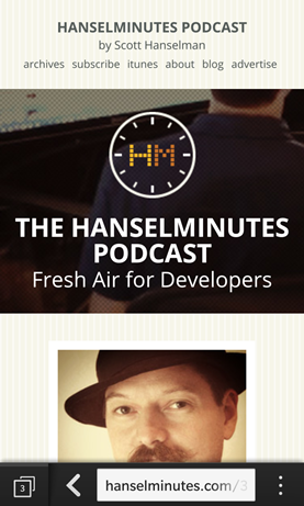
The browser is excellent. It supports much of HTML5, CSS3 and Media Queries and modern sites like my blog and podcast site rendered great. It's not quite Mobile Safari but it's very close. Fonts render clear and clean and the 1280x720 screen is fantastic.
Your Information
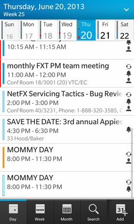
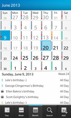
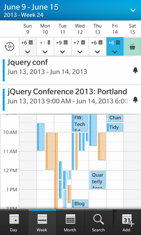
The calendar is has such potential, although the Month View is useless, as it is on literally ever smart phone I've ever used. It's all birthdays and wasted space. Week View tips over quickly as well once you start having anything that resembles a normal person's schedule.
Email and The Hub
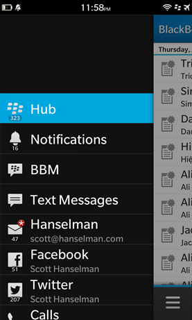
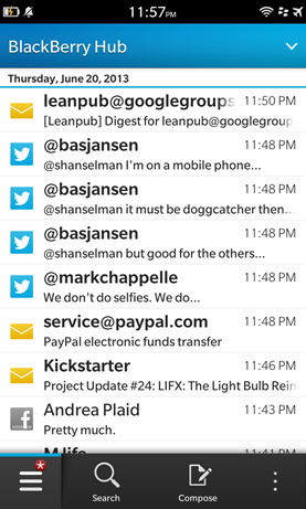
The one differentiator that this Blackberry has is the omnipresent "Hub." It is always off to the site accessible from any app. It's Email and Facebook and Twitter and Texting all in one.
Pros
- Mini HDMI connection - I'm not sure I'd never use this, but I love that I have the chance. However with things like the Chromecast (and Miracast, AirPlay and Wi-Di) there's just no reason to have a physical connection to a large screen anymore. Or at least there soon won't be.
- Feels great in your hand - It feels like an iPhone 5. It's weighty, but not heavy, firm and well built. Even though the back comes off (a plus, so you can swap batteries) it still feels tight.
- Fast - It never lagged, swipes were recognized and responsive
- Blackberry Hub - Everything (Twitter, SMS, Email, etc) is all in one place. Reminiscent of the Windows Phone People Hub, but more "swiss army knife" with all your messages in one giant list, my only complaint is that the swipe to access the Hub is not-intuitive. You swipe up from the bottom, then turn 90 degrees and keep swiping to the right, like a right-turn sign.
- Browser - I was really impressed with the browser. It supports CSS3 media queries nicely and scrolls fast.
Cons
- Smallish battery - I never made it a full day without having to charge. To be clear, my iPhone barely makes it past 2pm, but I somehow expected more from a Blackberry. This batter is only 1800mAh.
- Small App Ecosystem - The Angry Birds, Twitters, and Facebooks are all here, but once you start digging it's clear that this is a paper dragon of an AppStore.
If you're #teamblackberry and you have #iphoneenvy then this is likely the phone for you. However, there's no compelling reason to switch if you already have a smart phone. If you're in the market for your first smart phone, I'd consider one of the top three phones, as I just don't see Blackberry winning. Still, it's an impressive first outing.
© 2013 Scott Hanselman. All rights reserved.
